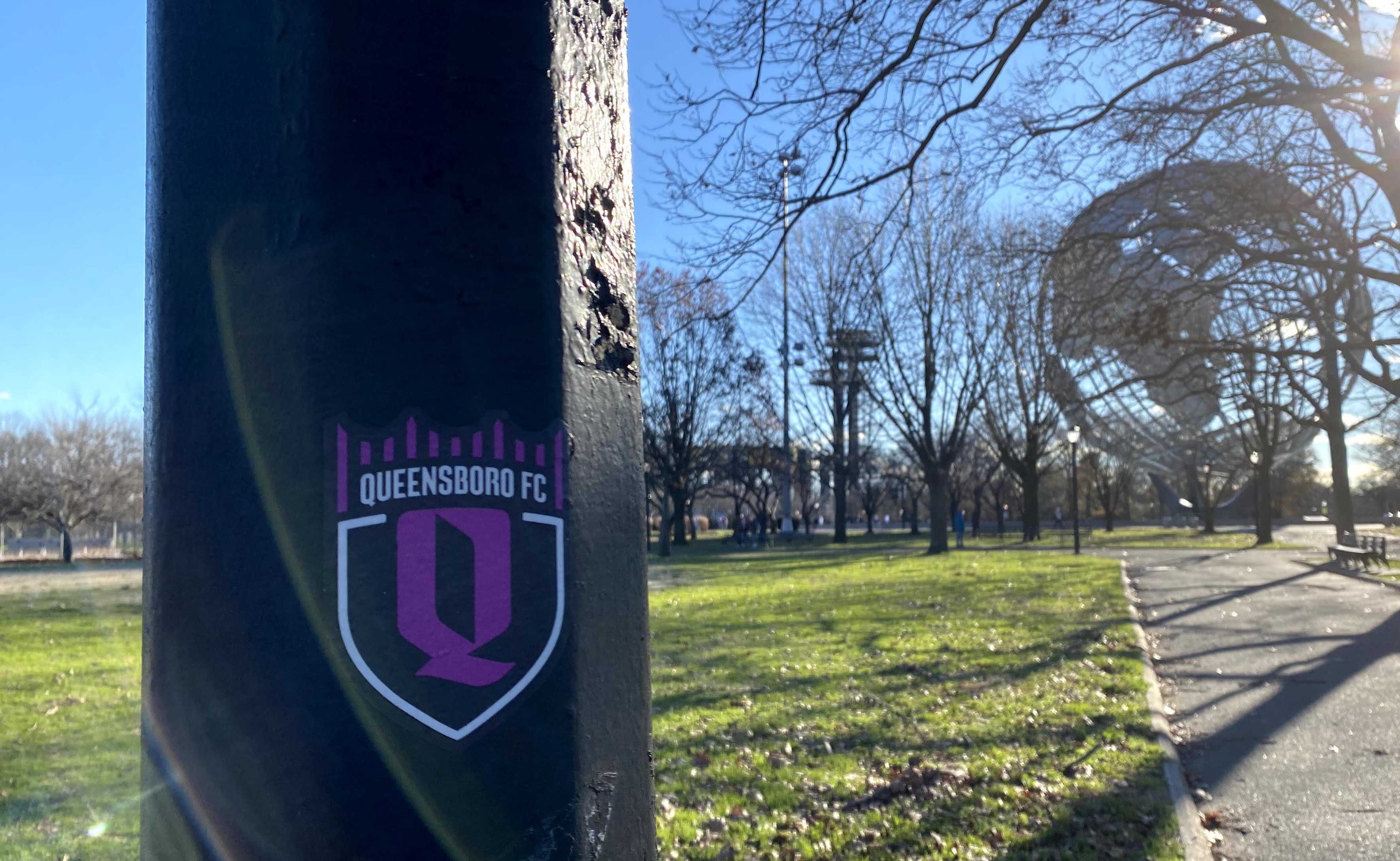
I spotted a Queensboro FC logo in the wild for the very first time Sunday in freezing Flushing Meadows Corona Park, though I’m not quite sure I can classify it as “in the wild.” I suspect QBFC strategically placed the sticker on that lamppost to encourage exactly this sort of photo: The crest with the Unisphere and the Observation Towers in the background.
It’s a fitting place for it because Flushing Meadows is New York City’s soccer mecca. On Sunday, a couple league matches were going on on the fields nearby, and a few small groups of adults were kicking the ball around on patches of dirt and grass.
It will be interesting to see how QBFC tries to captures that Flushing Meadows energy. NYCFC has sponsored a few asphalt courts, but they’re not involved in the day to day — plus they play in a cavernous Bronx stadium with few players who live in New York City neighborhoods.
QBFC has a real chance to become a community institution. It’s something they should lean into hard if they want to address some real local needs, generate serious support and overcome the awkward artificial branding of a new club (like the songs, cheers and AstroTurf fandom that NYCFC manufactured when they formed).
Imagine if QBFC decided to hold practices in Flushing Meadows park? That would be pretty cool. They could sponsor leagues and regular tournaments, too.
They say they plan to position themselves as community team. As a club entering the USL, the second level of US professional soccer, they could offer real access and stock the roster with “regular” guys — standout players from in and around Queens who will make QBFC popular among the youth teams, schools and neighborhoods where they have their roots.
But the best way to be a community team would be to actually get involved in the community, and not just around the holidays or for PR purposes.
The club has already participated in some recent food drives and helped rally Census participation. With hundreds of thousands of Queens residents experiencing food insecurity, they should establish a daily or weekly QBFC food pantry. They could make it an actual physical site and hire experienced people to run the program — a sort of QBFC social service wing.
That would be huge, and perhaps a model for other professional teams.
Back to that logo:
At first, I wasn’t so into the color scheme when the club unveiled the crest in October (something I reported for the Queens Eagle), but it grew on me quickly when I learned about the local transit influences.
The logo features a purple Q capped by a crown shaped like the Queensboro Bridge. The club chose a shade of purple to match the color of the No. 7 train symbol. And the designers created a custom typeface based on historical typography at Queensboro Plaza — that’s the coolest part.
The club says it will begin play in 2022, with the pandemic postponing their original plan of kicking off next year. So I guess we can expect to see this logo more often soon.
